
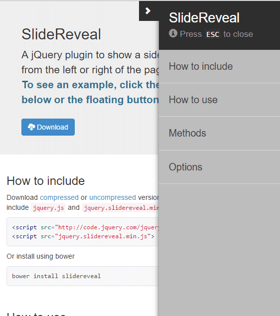
Below is the examples of how the plugin works:
/* Attach the Table CSS and Javascript */
<link rel="stylesheet" href="https://code.jquery.com/jquery-1.10.2.js">
<script src="stylesheet" href="https://maxcdn.bootstrapcdn.com/bootstrap/3.3.7/js/bootstrap.min.js"></script>
How to use it
You need to Use this class in your toggle button .model <button class="btn btn-primary model"> </button>
<button class="btn btn-primary model"> Slide to the left </button>
This is the main button once you click on it you can see your menu slide from left.
You need to add your Html in Id #main <div id="main"> </div>
<div id="main"> Your HTML is Here </div>
This is the main button once you click on it you can see your menu slide from left.
Code for a menu which comes from leftside (need to add this code after body tag).
     <div class="sidenav-wrap">
   <div id="mySidenav" class="sidenav">
    <a class="closebtn">×</a>
    <a href="#">About</a>
    <a href="#">Services</a>
    <a href="#">Clients</a>
    <a href="#">Contact</a>
    </div>
   <div class="overlayer"></div>
  </div>
     .left-245 {
   margin-left:245px;
  }

  .sidenav-wrap .overlayer {
   position: fixed;
   display:none;
   width: 100%;
   height: 100%;
   top: 0;
   left: 0;
   right: 0;
   bottom: 0;
   background-color: rgba(250,250,250,.8);
   z-index: 1;
   content:'';
  }

  .body-overflow-scroll {
   overflow:hidden;
  }

   /* The side navigation menu */
  .sidenav {
   height: 100%; /* 100% Full-height */
   width: 0; /* 0 width - change this with JavaScript */
   position: fixed; /* Stay in place */
   z-index: 1; /* Stay on top */
   top: 0;
   left: 0;
   background-color: #111; /* Black*/
   overflow-x: hidden; /* Disable horizontal scroll */
   padding-top: 60px; /* Place content 60px from the top */
   transition: 0.5s; /* 0.5 second transition effect to slide in the sidenav */
   z-index:999;
  }

  /* The navigation menu links */
  .sidenav a {
   padding: 8px 8px 8px 32px;
   text-decoration: none;
   font-size: 25px;
   color: #818181;
   display: block;
   transition: 0.3s
  }

  .show {
   display:block !important;
  }

  .wid-250 {
   width:250px;
  }

  /* When you mouse over the navigation links, change their color */
  .sidenav a:hover, .offcanvas a:focus{
   color: #f1f1f1;
  }

  /* Position and style the close button (top right corner) */
  .sidenav .closebtn {
   position: absolute;
   top: 0;
   right: 25px;
   font-size: 36px;
   margin-left: 50px;
  }

  /* Style page content - use this if you want to push the page content to the right when you open the side navigation */
  #main {
   transition: margin-left .5s;
   padding: 20px;
  }

  /* On smaller screens, where height is less than 450px, change the style of the sidenav (less padding and a smaller font size) */
  @media screen and (max-height: 450px) {
   .sidenav {padding-top: 15px;}
   .sidenav a {font-size: 18px;}
  }
     $(document).ready(function(){

  $(".model").click(function(){
   $("body").addClass("body-overflow-scroll");
   $(".overlayer").addClass("show");
   $("#mySidenav").addClass("wid-250");
   $("#main").addClass("left-245");
  });

  $("a.closebtn").click(function(){
   $("body").removeClass("body-overflow-scroll");
   $(".overlayer").removeClass("show");
   $("#mySidenav").removeClass("wid-250");
   $("#main").removeClass("left-245");
  });

  });
Click here to Download Code Download
-min.png)